Hey all – today as I await the arrival of my new army, thought I’d talk through the background and approach to a colour scheme. It is rare or me to start a full army from scratch – usually it is more an incremental process of adding one unit, or else having so much at once that you just want to paint something. A skirmish list is a good size to plan and paint in a uniform manner, and the ISA a good force to do get right first time and stay consistent.
1: SDS Background
The Iron Star Alliance is a vast bureaucracy, relying on people at all levels to follow the rules. When governors and agents of the law are suspected of corruption, or external threats infiltrate Alliance worlds, the Secret Defense Service Section 3 is relied on to lance the threats to order.
Lieutenant Garmon operates a web of agents across worlds, keeping his eye out for signs of incompetence and corruption. A pragmatic figure operating against powerful rulers, his small force relies on every advantage of camouflage and timing to covertly capture or eliminate the problems before they can muster a defense. Often working with mercenaries and underworld figures willing to operate against officials, once they are defeated he can push his allies underground again and rebuild order. Rulers scoff at the “Inquisitor” outside his jurisdiction – but rightly fear his zeal. Garmon is often forced to use his discretion: treading a line between his authority, resources and need to complete his objectives. As long as he is successful and discreet, his methods are tolerated by the SDS, but always risks consequences if he fails or oversteps his remit too far.
2: Colour Inspiration
I was looking for something a bit different from the normal ISA force, so a covert force with less bright colours but still showing off the shapes of the armour. A quick search on Sci Fi Special Forces gave some good inspiration – some ideas below.
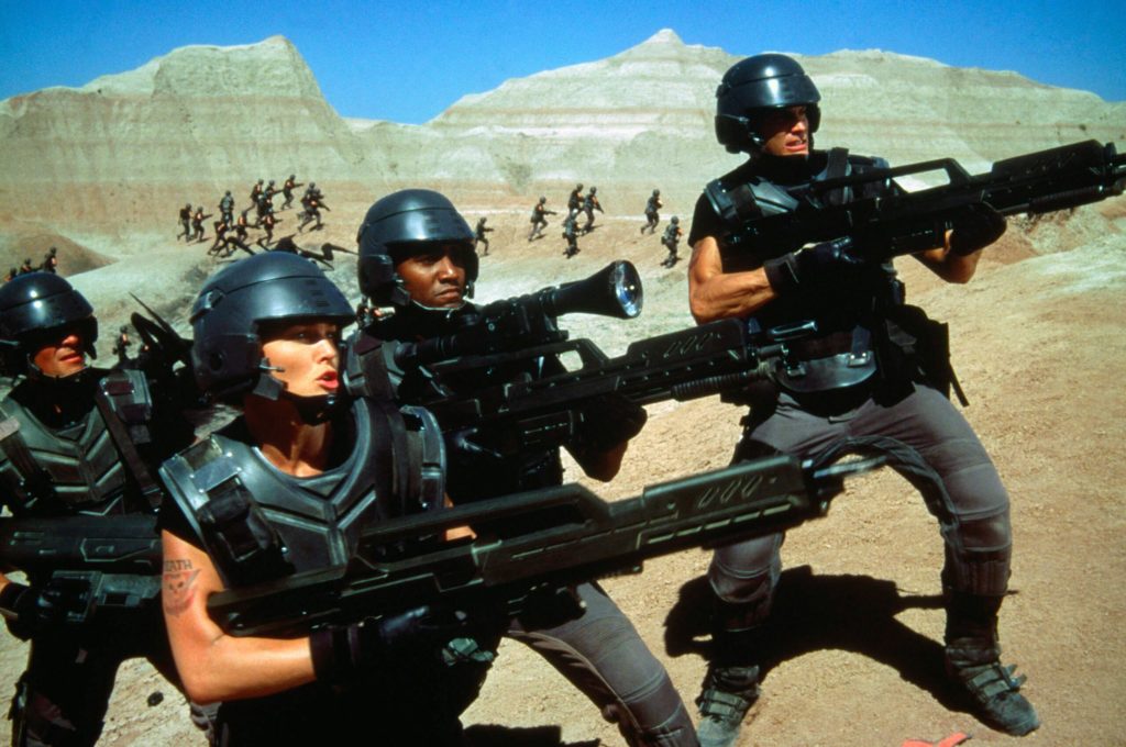

The “Starship Troopers” shot is a good example of the armour shapes standing out with a high gloss black-metal, and the shines on the top of each plate.
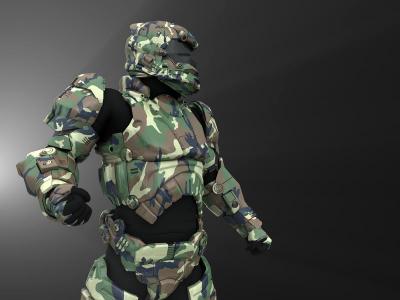
The female operative shows some good bright glows and different greys – blacks on the suit. This may be a good starting point for colours.
The third shows camo, which I am interested to experiment with to honour the covert vision.
So thinking I wanted something dark and glossy, using the colours of the woman, and some experimenting with camo. I also want some freehand unit markings on helmets or shoulders – the elite troopers painting icons, honours, or kill counts onto their armour. This will help to focus the eyes, and give room for an extra splash colour to break up the otherwise dark scheme.
3: Digital Experimentation
Goal was to get an idea what I wanted from my paint scheme.
- I fired up photoshop and loaded some ISA pictures from the concept art book: an Enforcer and Firebrand to test a scheme on both.
- Used the ‘magic wand’ tool to select areas of similar colour (non-contiguous). This took a few attempts and tolerances to get right, and separate different areas for bulk recolouring later
- Created a new layer and drew white over the whole layer (using fill tool with high tolerance and non-contiguous). This left me with areas to recolour later, so I could switch colours everywhere on the layer with the fill tool.
- Continued until I had layers with all the areas to recolour (most of the image)
- Used paintbrush to draw on some example freehand unit markings on helmet, shoulder and “wings” of the Firebrand.
- Shifted the original image to black & white and put it behind all the other layers
- Once I had all the main areas on separate layers, I experimented with diffrent colours using the fill tool, then blend modes between multiply & normal, and opacities.
- I kept iterating until I got something ok, then saved an image. Goal wasn’t to get a photorealistic look, just to see how the colours interact over the shapes of the model
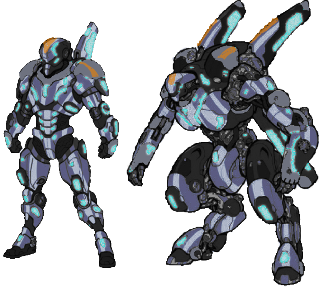
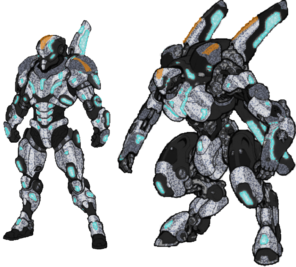
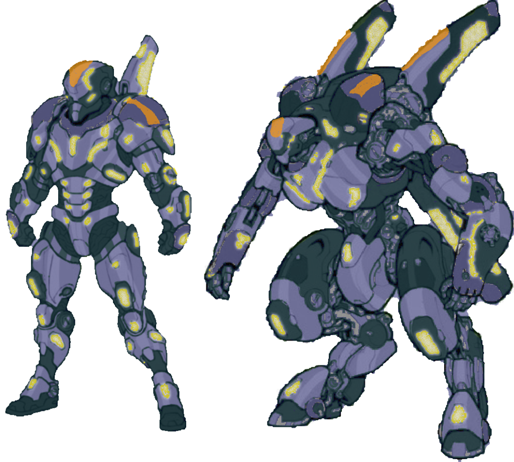

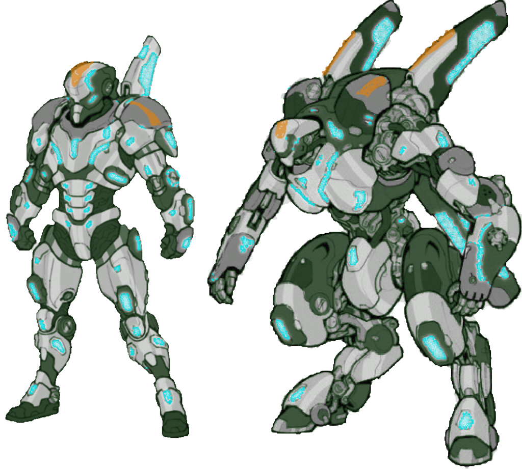
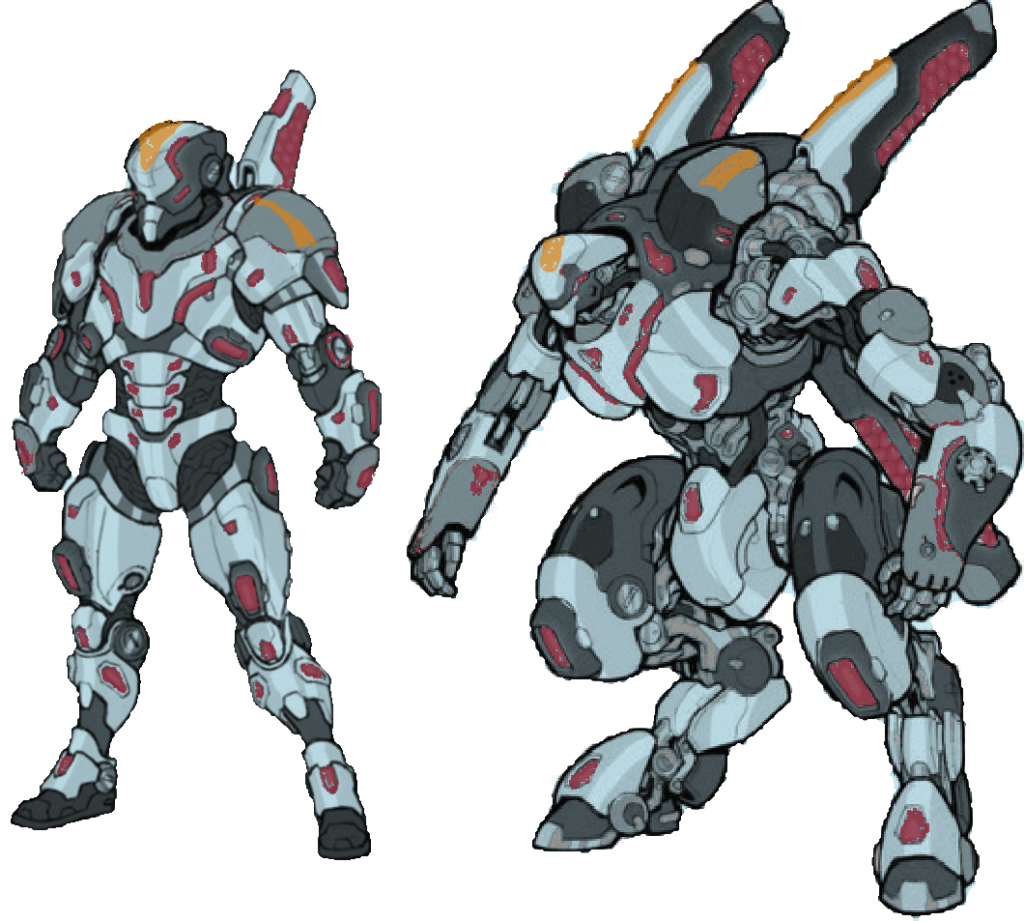
The first scheme with blue-steel colour mixed with black and grey plates, blue glows and orange markings stayed my favourite. The second shows an example of a camo scheme on the main plates, however it distracts the eye, hides the shape of the armour, and looks annoying to paint. The others had some potential, and I don’t mind the lighter silver schemes in 5 & 6, however will stick with scheme 1.
Some of the colour theory of scheme 1: the orange markings are a warm complementary colour, which usually looks good against a mostly cool-blue grey scheme over the rest. The glows are also high value & saturation contrast against the darker grey armour, even though they are a similar blue hue.
The devil will be in the detail translating this to the model – getting the contrasting colours right without overpowering anything too much. As a plan, I will do a zenithal highlight, some prework to fill the white highlights and blackest shadows, then a contrast style heavy wash (using a home brew recipe with inks). This should give a desaturated base with the shadows mostly finished, to work some more saturated gloss shines and glows on top of. I’d also like to experiment with the texture on the orange markings to make it look painted on: starting with a salt chipping effect to break it up and look more crudely painted than the rest of the armour.
Once the models arrive, I will do some experimentation on a test model and refine the process before doing the rest in bulk. If this process interests you, comment, like, hit the bell, let me know and I will do a follow up article including ‘the recipe’ I discover. However based on my digital paintjob, I have confidence that there is a good colour scheme I can aim at.
4: Bases
One thing I love about the Warcaster Aesthetic is the hexagon pattern, which the ISA use more than anything. It was while looking at a non-stick frypan that I noticed it had a similar pattern. I coated it in petroleum jelly, mixed some milliput, pressed it into the pan and waited for it to set. It was annoying to remove and cut to size in a big blob, but glue and paint showed the concept worked. Paint so far is just black with grey drybrushes, and a bit of brown wash to make it look more natural.
Bases like this are hard to judge in isolation. I think the grey cobblestones will be a bit drab against the grey-black armour on top, but will experiment with colours on my completed models. I will also put the milliput directly on the bases and press the bases into the pan next time, rather than casting a ‘sheet’ of cobblestones and cutting to size.
Conclusion
So that’s it, a plan to follow once my models arrive, and idea of where it fits into the world. I hope to continue this series once I assemble and paint more. As they say, no plan survives contact with the enemy, so we will see how it works once the paint hits the models 🙂